Font Poster
Typography
Illustration
Heirarchy
Overview
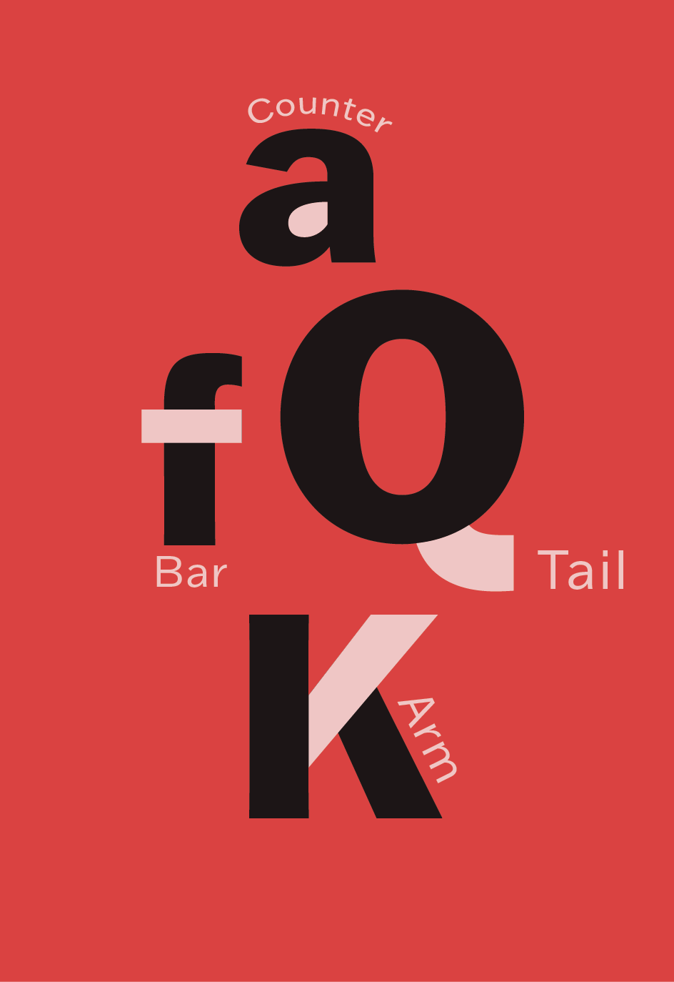
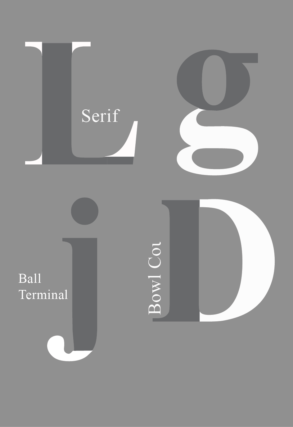
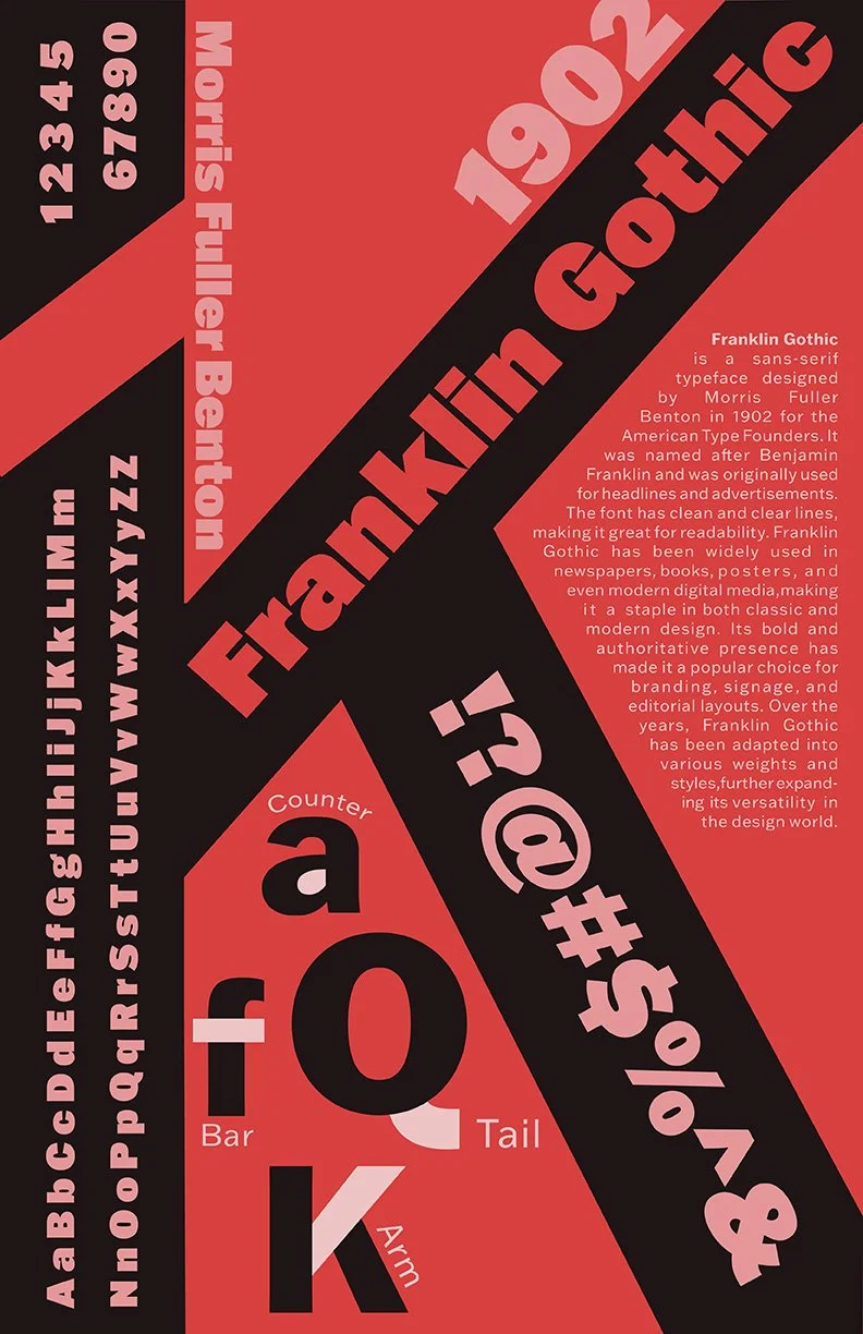
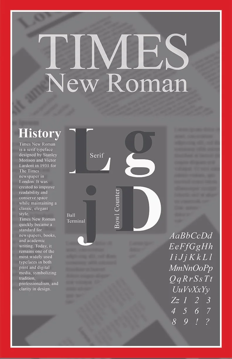
In this exploration of typography I created posters of 2 different fonts exploring the history of them and their anatomy. Not only would I have to research the fonts but also create visual appealing posters of them. The task asked me to include a brief history of the font, anatomy explorations of at least 4 letters, and include all characters. Fitting all the information on this page while still maintaining a clean design that didn’t feel crowded or overwhelming would prove to be difficult.
Solution
The two fonts I would choose would be Franklin Gothic for a sans-serif font, and Times New Roman a serif font for contrast. I researched both fonts to get a better idea of the use and purpose they served to help me decide on the direction of the design. Traditionally I found Franklin Gothic is used for big headlines and posters so I went with a design that displays the font huge. For Times New Roman I was inspired by the style of a Time magazine since this is one of the most popular uses of this font. In addition, I made sure to include newspapers than can be found in the background to pay homage to the origins of Times New Roman