Minizine
Editorial
Layout
Overview
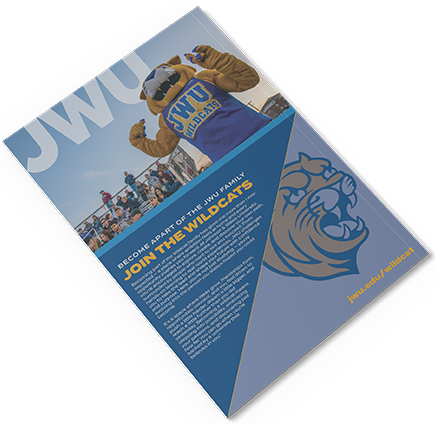
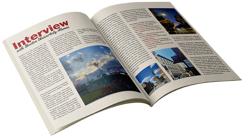
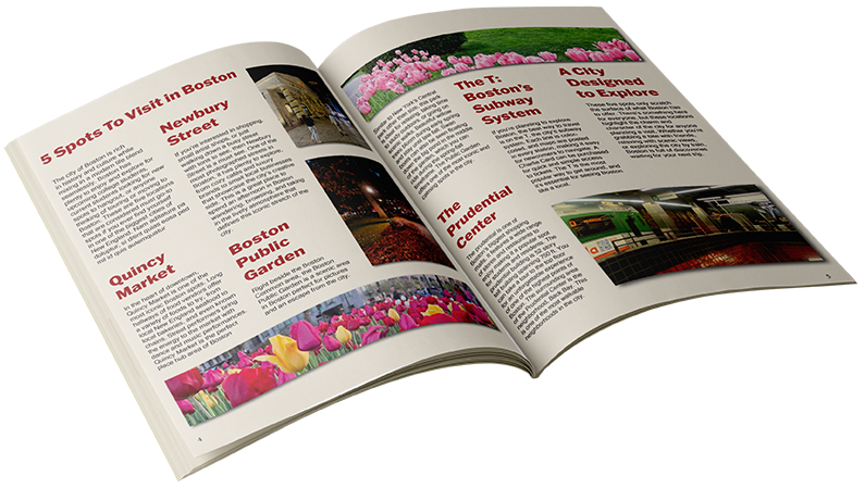
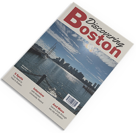
This minizine project called for creating a magazine with only a few pages based on any theme. This means a cover, three spreads, back, and a brand identity to go along with it. “Discovering Boston” was made, a traveling magazine that showcases the beautiful views of the city. This project required a great amount of text to be written but also maintaining a readable layout on each page. Photos had to be taken by hand unless instructed otherwise such as the JWU ad on the back. This meant keeping in mind the size of the images so that they don’t lose quality as well as traveling to Boston to take photos.
Solution
My direction for this project was to make a clean layout that would allow my photos to stand out while also making the text comprehendable. I’m not too familiar with magazines and the layout of them so the first step would be researching them. Inspiration was drawn from Travel magazines that had a grid base design having a focus on images. Columns were used for text to be broken up and easier to view for the reader. Justified text was also use to reinforce the grid.